Table of Contents (10 sections)
Creating a beautiful and inviting modern home begins with the right color combinations. In this article, I will share my insights on effective color pairings that can drastically improve your living space. Whether you prefer a minimalist approach or a vibrant style, understanding how color works together is crucial for achieving a cohesive and appealing look.
Understanding Color Theory
Color theory provides a foundational understanding of how different colors interact with each other. In its simplest form, colors can be divided into categories such as primary, secondary, and tertiary colors. For a modern home, I find it essential to focus on the concept of complementary and analogous colors. Complementary colors are located opposite each other on the color wheel—like blue and orange—which create a striking contrast when used together.
On the other hand, analogous colors are next to each other on the wheel, such as blue, green, and teal. They provide a more harmonious and subtle blend, perfect for creating calm spaces. When exploring color combinations for a modern home, I recommend considering both types to determine which fits your aesthetic best. For instance, integrating accents of complementary colors can create focal points in a room while keeping the bulk of walls in analogous hues for balance.
Popular Color Palettes for 2026
The trends in color palettes evolve every few years, and as of 2026, some combinations are standing out in the design world. Here are a few that are particularly appealing:
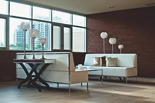
- Soft Neutrals and Earth Tones: Pairing soft whites, beiges, and tans with earthy greens and browns creates a soothing atmosphere, offering a connection to nature.
- Bold Jewel Tones: Colors like emerald, sapphire, and ruby can add drama and sophistication when combined with rich golds or silvers as accents.
- Monochromatic Schemes: Using varying shades of a single color can add depth while maintaining a unified look. A monochromatic blue scheme, for example, with navy, sky blue, and powder blue can be both calming and elegant.
Step-by-Step Guide to Creating a Color Scheme
Creating a color scheme doesn’t have to be overwhelming. Here’s a simple step-by-step process I recommend:
- Choose a Base Color: Start with a color you love or that represents your personality.
- Identify Your Accent Colors: Pick 2-3 accent colors that complement the base color. These can be contrasting or analogous shades depending on your desired effect.
- Test Paint Samples: Apply small swatches of your chosen colors on the walls to see how they look in different lighting throughout the day.
- Consider Furniture and Decor: Think about how your color choices will work with existing furniture and decor; some colors might clash, while others may perfectly unify your space.
- Finalize Your Palette: Once you have an idea of how everything looks together, finalize your colors by investing in high-quality paint and decor items.
Color Combinations: Pros and Cons
It's essential to weigh the strengths and weaknesses of color combinations before making final decisions. Here’s a comparison of two popular modern palettes:
| Color Palette | Strengths | Weaknesses | Verdict |
|---|---|---|---|
| Soft Neutrals + Earth Tones | Calm, versatile, connects with nature | Can feel monotonous if not varied | Good for tranquility |
| Bold Jewel Tones | Dramatic, luxurious | Might clash with other colors | Excellent for a bold statement |
The Role of Lighting in Color Perception
Lighting plays a pivotal role in how we perceive colors. Natural light can make colors appear cooler or warmer, while artificial lighting (like warm yellow bulbs vs. cool white LEDs) can change the mood of a space instantly. In my testing, rooms painted the same color can look utterly different based on the lighting. For instance, a room with south-facing windows may showcase a vibrant yellow as brighter, whereas a north-facing room may render it duller.
When selecting colors, it's crucial to factor in the natural light in your home. Aim to test your color palette at various times of day to capture how light interacts with colors. This attention to detail can enforce your design choices.
FAQ: Color Combinations for a Modern Home
What color combinations work best for a small room?
Using light, neutral colors like soft grays or whites can make a small room feel more spacious. Accent walls with slightly darker shades can create depth without overwhelming the space.
How can I incorporate multiple colors without clashing?
Start with a predominant color and choose 1-2 complementary colors. Use one color for larger spaces and accents for smaller pieces or accessories to maintain balance.
Are there color combinations to avoid?
Avoid using overly bright or clashing colors like neon hues paired together. They can create a chaotic environment. Instead, opt for more muted tones or offset with neutrals.
How often should I change my color scheme?
It depends on your personal preference. However, a change every 5-7 years is typical, allowing you to refresh your environment while staying in line with trends.
📺 Resource Video
> 📺 For more inspiration: Find out how to choose the perfect color palette for your modern home, an insightful guide. Search on YouTube: color combinations modern home 2026.
Glossary
| Term | Definition |
|---|---|
| Complementary Colors | Colors located opposite each other on the color wheel, often used to create contrast. |
| Analogous Colors | Colors that are next to each other on the color wheel, creating harmony. |
| Monochromatic Scheme | Use of different shades of a single color for a unified look. |
Checklist before your renovation
- [ ] Choose a base color
- [ ] Select 2-3 accent colors
- [ ] Test color samples in the room
- [ ] Consider the existing decor
- [ ] Evaluate natural lighting throughout the day
In conclusion, understanding color combinations in a modern home can dramatically transform your space. With informed choices based on experience and knowledge of color theory, you can create an environment that is both stylish and welcoming.
Ready to take the plunge into the colorful world of home decor? Start planning your color scheme today and transform your space into the modern haven you deserve!