Table of Contents (10 sections)
Choosing a color scheme for your home is no small task. The colors you choose can affect your mood, your productivity, and your overall enjoyment of your space. In this guide, we’ll help you navigate through the process of selecting the right colors that will harmonize with your decor style. Let’s explore the key steps to define your perfect palette!
Step 1: Understand the Basics of Color Theory
Color theory is fundamental when choosing a color scheme for your home. It involves understanding how colors interact, the emotional responses they evoke, and how they can be utilized to create a cohesive look. There are three main categories of colors:
- Primary Colors: Red, blue, and yellow—the building blocks of all colors.
- Secondary Colors: Colors created by mixing primary colors, such as green, orange, and purple.
- Tertiary Colors: These are created by combining primary and secondary colors.
Moreover, colors can be classified as warm (reds, oranges, yellows) or cool (blues, greens, purples). Warm colors tend to create a stimulating environment while cool colors promote calmness. Understanding these concepts can help you make informed decisions about your home's aesthetics based on the ambiance you wish to create. This foundation will guide you toward a color scheme that resonates with your personal style and the function of each room.
Step 2: Identify Your Style
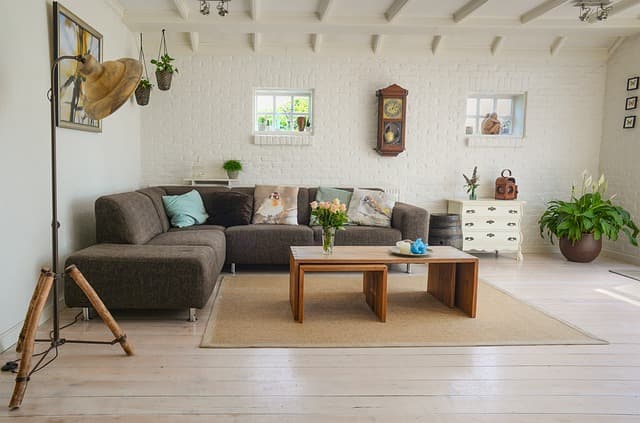
Before diving into colors, it’s essential to identify your decor style. Are you going for a modern, minimalistic look, or do you prefer a cozy, traditional aesthetic? Each style pairs well with certain colors:
- Modern: Typically characterized by neutral shades with bold accent colors. Think of whites, grays, and blacks coupled with a vibrant yellow or teal.
- Bohemian: This style thrives on a mix of warm, rich colors, such as deep reds and browns, complemented by vibrant hues and patterns.
- Scandinavian: Simplistic and functional, this design benefits from light colors like whites paired with soft pastels and warm wood tones.
Creating a mood board can help you visualize how different colors can play out with your chosen style. Make sure to collect images and color samples that resonate with you before proceeding.
Step 3: Create a Color Palette
A well-thought color palette involves combining 3-5 colors that harmonize together. One effective method to achieve this is by choosing:
- A Dominant Color: This is the main color in your room, typically used for walls.
- A Secondary Color: This supports the dominant color and is used for larger furniture pieces.
- Accent Colors: These are bolder colors that can be incorporated through accessories, such as cushions, artwork, or decor items.
Common combinations include blue as a dominant color paired with beige and coral as accents. Remember to test the colors against your chosen lighting conditions—natural and artificial light can change the appearance of colors significantly. In 2026, many designers also recommend using digital tools or apps to visualize how chosen colors will interact within your space.
Step 4: Consider the Lighting
Lighting is a crucial, often overlooked element in color selection. Different types of lighting affect how colors are perceived:
- Natural Light: Offers the truest representation of color. It changes throughout the day, so consider how this may impact your chosen tones.
- Warm Artificial Light: Can enhance warm colors, making them feel cozy, but may mute cooler tones.
- Cool Artificial Light: Can brighten up room spaces and enhance cooler colors but might make warm colors appear stark.
Plan to test your colors in the actual room with your lighting conditions. Paint samples on the walls and observe them throughout the day. This vital step will help you avoid unfortunate surprises later.
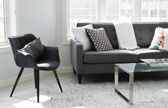
Step 5: Make Decisions on Finishes and Textures
The final step when assembling your color scheme is to consider the finishes and textures of your furnishings and decor. Matte finishes lend a soft, casual appearance, while glossy finishes can make colors appear more vibrant and modern. Fabrics also play a significant role—natural materials like linen or cotton can soften a color, whereas synthetics like nylon might intensify it.
As an example, a soft gray textured wall paired with smooth leather furniture can create a sophisticated look, whereas matte finishes on walls might absorb light differently compared to shiny finishes. Opt for a mix of textures to elevate the color scheme further and add depth to your design.
Color Scheme Comparison
| Criteria | Option A | Option B | Option C | Verdict |
|---|---|---|---|---|
| Dominance | Warm | Cool | Neutral | Suitable for modern style with an accent. |
| Mood | Cozy | Calm | Balanced | Warm creates comfort, cools provide calmness. |
| Lighting Use | Daylight | Dim | Mixed | Most versatile color scheme suitable for most conditions. |
| Application | Bedroom | Living | Kitchen | Choose based on intended use and mood. |
📺 For further insights:
Discover how to apply these techniques effectively by watching videos on YouTube on the topic: 'perfect color scheme for home'.
Checklist Before You Decide
- [ ] Understand the basics of color theory.
- [ ] Identify your personal decor style.
- [ ] Create a balanced color palette.
- [ ] Test colors in actual lighting conditions.
- [ ] Explore finishes and textures for your furniture.
Glossary
| Term | Definition |
|---|---|
| Color Theory | A study of how colors interact and the feelings they evoke. |
| Accent Color | A color used to contrast or enhance the dominant color in a palette. |
| Natural Light | Light from the sun that impacts the appearance of color in a room. |
> 🧠 Quick Quiz: Which color schemes tend to create a calm environment?
> - A) Warm colors
> - B) Cool colors
> - C) Neutral colors
> Answer: B — Cool colors like blue and green promote tranquility.
Choosing the right color scheme for your home elevates not only the aesthetic quality of your space but also enhances your overall living experience. Embark on your color journey today and embrace the power of color!
📺 Pour aller plus loin : perfect color scheme for home sur YouTube