Table of Contents (11 sections)
Choosing the right decor palette is fundamental to achieving a cohesive and inviting atmosphere in your home. With various trends and an array of colors to choose from, making the right decision can be daunting. This guide will walk you through the essential steps to select a decor palette that reflects your style and complements your living space.
Step 1: Define Your Style
Before diving into color selections, it is essential to define your style. Consider the overall theme you want to establish in your home. Are you leaning toward a modern, minimalist aesthetic, or do you prefer a cozy, traditional look? Understanding your preferred style will serve as a foundation for your decor palette.
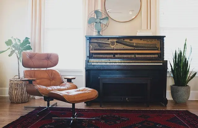
Take inspiration from interior design resources such as magazines or platforms like Pinterest. Furthermore, identify key pieces of furniture or artwork that you want to keep as focal points. For instance, if you have a vintage couch in rich tones, this can guide your color choices towards complementary palettes, enhancing the overall aesthetic.
Step 2: Consider Natural Light and Room Size
The amount of natural light that illuminates your home significantly influences how colors appear within the space. Lighter shades create an open and airy feel, making them suitable for smaller rooms or those with limited windows. Darker hues can add depth and intimacy but may make a space feel smaller if not balanced correctly.
In larger rooms, consider a mix of both light and dark colors to create depth. Implementing a decor palette that synergizes with your home's natural lighting can create a harmonious transition throughout your spaces. As a bonus tip, test paint samples on your walls in different lighting conditions to observe how the colors shift throughout the day.
📺 Resources for Further Learning
> 📺 For a deeper understanding: How to Choose a Color Palette for Your Home, highlights essential elements in designing your decor palette. Search on YouTube with the keywords: Home decor color palette ideas 2026.
Step 3: Test Color Combinations
Once you have an idea of your style and lighting, it’s time to experiment with color combinations. Start gathering paint chips or swatch samples that resonate with your vision. Use a color wheel to visualize how colors work together. A great rule of thumb is the 60-30-10 rule, which suggests using 60% of your primary color, 30% of a secondary color, and 10% of an accent color.
For instance, if you choose a soft blue for your walls, consider pairing it with white furniture and a touch of golden accessories. This not only maintains a sense of continuity but also adds sophistication and visual interest to your decor. Be sure to avoid overly contrasting colors that may clash and create visual chaos.
Step 4: Accentuate with Textures and Patterns
Texture play is crucial when finalizing your decor palette. Incorporating different materials, such as wood, glass, and fabric, can enrich your color choices. Think about how different textures will work together to enhance the visual appeal of your space.
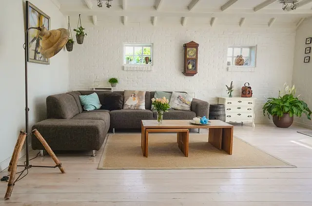
Introduce patterns through rugs, cushions, or artwork that pulls colors from your palette together. For example, if your decor palette includes shades of green and cream, a rug with those colors can tie the room together while adding a textural layer. Consider various fabric types, as they can significantly impact how colors present in different light.
Step 5: Finalize Your Palette with Accessories
Accessories can complete your decor palette and allow for easy updates as styles or preferences change over time. Choose decorative items such as vases, artwork, and throw pillows that reflect your chosen colors. It’s an excellent opportunity to introduce elements that showcase your personality.
Opt for seasonal decorations that can easily swap out without the need for major renovations. For example, introducing warm autumn colors through accessories in the fall can bring freshness to your decor, while maintaining your established palette.
Comparative Table of Decor Palette Elements
| Element | Warm Tones | Cool Tones | Neutral Tones | Verdict |
|---|---|---|---|---|
| Atmosphere | Cozy and inviting | Calm and refreshing | Balanced and adaptable | Choose based on desired mood |
| Compatibility | Works well with wood textures | Pairs with metal and glass | Universal, fits any style | Perfect for versatile decor |
| Trendiness | Bohemian and eclectic | Modern and sleek | Timeless styling | Aligns with current trends |
| Maintenance | Requires more upkeep | Generally low maintenance | Easy to refresh | Make a choice based on lifestyle |
Checklist Before You Start
- [ ] Define your home style
- [ ] Assess lighting conditions
- [ ] Gather color samples
- [ ] Experiment with combinations
- [ ] Incorporate textures
- [ ] Finalize with accessories
Glossary
| Term | Definition |
|---|---|
| Decor Palette | A set of colors designed to coordinate in a living space for aesthetic appeal. |
| 60-30-10 Rule | A guideline for color distribution in decor, promoting balance and visual interest. |
| Accent Color | A contrasting color used in small quantities to enhance a primary color. |
---
📺 Pour aller plus loin : Home decor color palette ideas 2026 sur YouTube
Recommended products
Selected by our experts

Clinique All About Shadow™ Quad Eye Shadow Palette, Morning Java - Shimmer - 0.16 oz
clinique.com


Bobbi Brown Limited-Edition Threads of Love Eyeshadow Palette
bobbibrowncosmetics.com