Table of Contents (12 sections)
Creating a visually appealing atmosphere at home is an art form that requires understanding the fundamental principles of color layering. But what exactly is color layering? At its core, it refers to the strategic application of different colors in various elements of your home decor to create a balanced, harmonious look. This technique not only enhances the overall aesthetic appeal but also dictates the emotional tone of a space.
Achieving a successful color layering scheme involves several key considerations such as the interplay between light and color, the size of the space, and the desired mood. Research shows that the right colors can significantly impact psychological processes; thus, choosing the right shades can create feelings of serenity, warmth, or energy. In 2026, with the rise of minimalism, more people are turning to color layering as a way to add depth and personality to their spaces without overwhelming the senses.
To master the art of color layering, we will explore a detailed step-by-step guide that comprises crucial actions you can take to elevate your home decor. Let’s dive in!
1. Understand Color Theory
Before you embark on your color layering journey, it’s essential to familiarize yourself with color theory. This foundational knowledge provides insights into how colors interact with one another and can significantly affect the ambiance of your home.
The color wheel is a useful tool, illustrating primary, secondary, and tertiary colors. Colors that sit opposite each other on the wheel are known as complementary colors (e.g., blue and orange), while analogous colors are those that sit next to each other (e.g., blue, turquoise, and green). For instance, while complementary colors can create striking contrast, analogous colors tend to blend harmoniously.
Additionally, consider the emotional resonance of colors. According to psychology, colors evoke specific feelings; for example, blue exudes calmness, while red signifies energy. As you start to layer colors in your home, lean into these emotional cues and think about the atmosphere you want to cultivate in each room. By understanding color theory, you’re better equipped to make intentional choices that resonate with your personal style.
2. Assess Your Space
Once you’ve grasped the basics of color theory, the next step is to assess your space. Consider the size, natural lighting, and existing elements in your home. A small room might feel cramped when painted in dark hues, while a large space can feel emptier and cold without a rich color palette.
Take a walk through each room and note the existing colors and materials. What color schemes currently dominate? What mood does each room convey? Grab a notepad and jot down any initial thoughts or feelings about the space.
Also, factor in the placement of natural light. Rooms with ample sunlight provide versatility, allowing for darker hues without feeling oppressive. Alternatively, darker rooms can benefit from lighter tones that bounce light around, creating an illusion of more space. This completed audit equips you with the necessary context to plan your color layering effectively.


3. Choose a Base Color
With insights from your space assessment, it’s time to choose a base color. This color will serve as the foundation for your color layering and provide a consistent backdrop that complements other hues. Typically, the base color should be neutral—think whites, grays, beige, or taupe—allowing other pops of color to shine through.
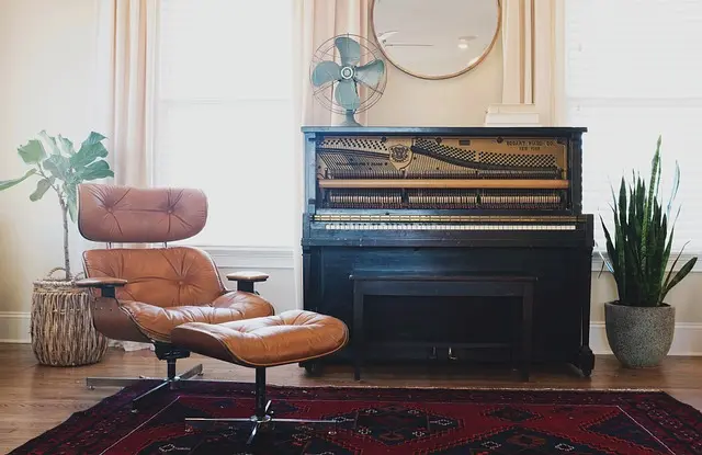
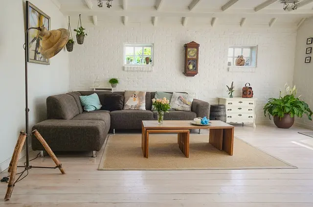
Once you select your base color, apply it to larger surfaces such as walls, big furniture pieces, or major decor items. For example, a soft gray wall can enhance the coziness of a living room when paired with colorful cushions or vibrant art. According to data from various interior design experts, utilizing neutral tones for the primary decor can increase the versatility of your space, making it easier to switch or update secondary colors as styles and trends evolve. Remember, your base color lays the groundwork for everything that follows!
4. Add Accent Colors
Having established your base, the next step involves introducing accent colors. These are the colors that will add visual interest and depth to your decor. Keep a balance in mind; it’s typically recommended to use up to three accent colors alongside your base. This layering not only creates a cohesive look but also prevents the decor from appearing too chaotic.
Consider incorporating these accent colors in smaller items—think throw pillows, art pieces, vases, or even furniture like a colorful chair. To select your accents, refer back to your color wheel: choose colors that are complementary or analogous to your base color. For instance, if your base color is a subdued gray, consider adding mustard yellow and deep teal as accents to create an inviting and dynamic atmosphere.
Color Layering Mistakes to Avoid:
- Overusing Bright Colors: Too many vivid colors can create a jarring effect.
- Neglecting Balance: Ensure that no single color overshadows the others.
- Ignoring Lighting: Different lighting can alter the perception of your colors dramatically.
5. Incorporate Textures and Patterns
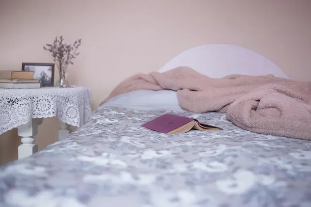
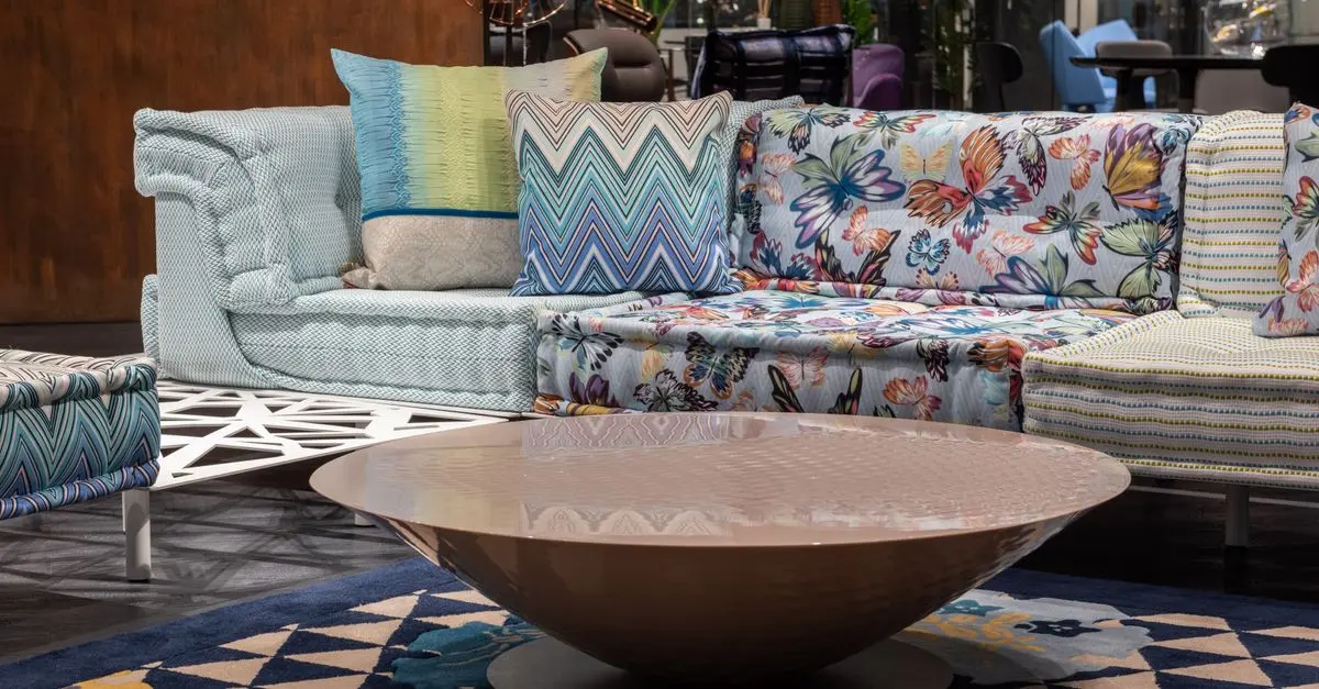
In addition to colors, textures and patterns play a critical role in elevating your decor. Incorporate varied textures—think smooth vs. rough, soft vs. hard—to add richness. For example, a plush velvet cushion layered against a linen sofa can create a beautiful contrast while also allowing your chosen accent colors to pop.
Patterns can be an excellent way to weave in your chosen colors without overwhelming the space. A patterned rug or decorative throw can introduce bold hues in a controlled way. When using patterns, try to limit them to two to maintain harmony, ensuring that they coordinate with both your base and accent colors.
Remember, the variability in textures not only brings visual interest but also establishes a dynamic interaction between the different layers. Statistics from interior design surveys indicate that engaging textures increase a home’s aesthetic appeal significantly, thus making it feel more inviting and warm.
6. Evaluate and Adjust:
After adding your chosen colors and textures, it’s crucial to take a step back and evaluate your space. Do the colors work well together? Is there a sense of balance and harmony? Sometimes, adjustments are necessary. Perhaps you need to swap out a vibrant pillow for a more muted option or introduce a new accent color to balance the room. Don’t hesitate to change things up until you find the perfect blend that resonates with your style.
A useful approach here is using photo documentation; take pictures in different lighting throughout the day and review them. This practice can reveal how colors change and breathe in your space over time. By consistently evaluating and adjusting, you’ll master the art of color layering and enjoy a truly personalized home environment.


Checklist for Successful Color Layering:
- [ ] Understand basic color theory.
- [ ] Assess your space and existing colors.
- [ ] Choose a neutral base color.
- [ ] Select up to three accent colors.
- [ ] Incorporate varied textures and patterns.
- [ ] Evaluate and adjust until satisfied.
📺 Resource Video
> 📺 For further learning: Watch videos on color layering techniques to see real-life examples and gather inspiration. Search on YouTube: color layering techniques in home decor.
Glossary
| Term | Definition |
|---|---|
| Color Theory | A framework explaining how colors interact and influence emotions. |
| Neutral Colors | Shades that do not typically clash with other colors, used to create balance. |
| Accent Colors | Colors used to enhance and contrast with the base color in decor. |
Conclusion
Mastering the art of color layering involves understanding both the fundamentals of color theory and the nuances of your personal space. The careful selection and combination of colors can transform a room, enhance its ambiance, and create a cozy, inviting atmosphere. So grab those paint samples, pick out your favorite textiles, and start layering your way to a beautifully decorated home today!
🧠 Quick Quiz: What is the primary function of a base color?
- A) To dominate the room
- B) To provide a neutral backdrop
- C) To be the only color used
Answer: B — A base color provides a neutral backdrop for accent colors.
We have selected several products suited for your decor needs. Discover our recommendations below!
📺 Pour aller plus loin : color layering techniques in home decor sur YouTube
Recommended products
Selected by our experts


Multicon Wholesale Hub Indoor Plant Growth Lamp, Full Spectrum Seed Lamp With Timer And Three Color Dimmable Floor Lamp Indoor Plant Growth Lamp,
inspireuplift.com